Strebe 1995 and Strebe Asymmetric 2011
Daniel »daan« Strebe, author of the map projection software Geocart,
has developd severeal projections. On his website, he lists
Strebe-Hammer,
Strebe-Kavraiskiy V,
Strebe-Mollweide,
Strebe-Snyder flat-pole,
Strebe-Snyder pointed-pole
and
Strebe-sinusoidal.
(Note Aug. 2018: The aforementioned projections are reviewed
in a blogpost I wrote.)
But the in my opinion most interesting projections are Strebe 1995 and Strebe Asymmetric 2011 (which is based on the aforementioned projection).
Regrettably, you don’t see them very often (at least, not over here in Germany) so I’m going to cover them here.
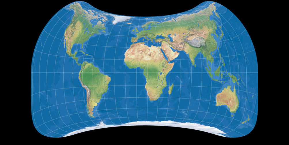
Strebe 1995
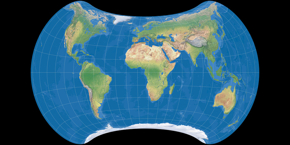
Note: Contrary to most other images on this website, this depiction is centered to 10° East, because
that’s the creator’s preferred setting (I think).
So, what’s the idea behind this projection? Quoting dann Strebe himself:
(…) the purpose of that projection is to preserve symmetry. It’s something that’s not supposed to look too horribly unfamiliar, it’s not supposed to be sliced up with interruptions, and most importantly the major technique I used was to push the distortion the distortion into the Pacific as much as possible and preserve the shapes of the land areas, while also keeping the map equal area.
Quoted from an interview on cartographicperspectives.org
And now I’m tempted to write: ’Nuff said.
Because Strebe’s quote says about anything that can be said about the projection. But I wouldn’t be me
if I didn’t keep babbling…
We’ll come back later to the thing about the symmetry.
»Not too horribly unfamiliar« – well, yes, it is not that much different from other lenticular projections we’re used to.
So let’s move on to the most interesting part, being to push the distortion the distortion into the Pacific as much as possible.
It’s smart to push the distortions into an area where no interesting things are. Of course, there are islands in the Pacific which I guess are wonderful places, but let’s be honest: An common world maps, they are but tiny dots, and to distort such tiny dots is of no consequence to speak of.
Especially not when in exchange the big land areas keep their shape, and yes, they do that on the Strebe 1995. Let’s have a look at a depiction with Tissot’s indicatrix, restricted to the land masses:
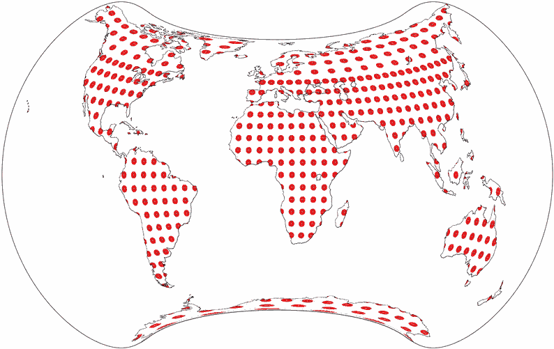
Here it’s quite obvious that indeed the distortions of the land masses indeed are delightfully low. Well, except maybe for Antarctica, the northern parts of Greenland (which both doesn’t seem that bad) and Australia as well as New Zealand (again, I’ll come back to this later).
There is, of course, a catch. (Isn’t there always?)
Basically, the projection doesn’t push the distortion into the Pacific but to the edges of the map, where
the Pacific happens to be if you center the map to 10° East (or someplace near, like the Greenwich meridian).
But if you prefer a pacific aspect to put Asia or Oceania to the center, the distortion will be pushed into the Atlantic –
and since the Atlantic is much smaller than the pacific, the distortion will effect the land areas, too… partially significant!
Under these circumstances it might be better to switch to a different projection, e.g. Wagner VII (to name another equal-area projection), but even here the result is ambiguous: While Africa and South America are less distorted on Wagner VII, North America and Europe are actually better off with Strebe 1995:


Usage
Note: I’m no cartographer. The recommendations below are made by a complete layman!
Political Map
There are people who think that a world map should always be equal-area in order to neither favour nor discriminate any country.
And some of those people designed world maps which, for some inexplicable reason, dreadfully distort exactly the parts of the world which
were meant to benefit from the new projection.
Although I don’t agree with this thesis, I do think that it’s very helpful to know equal-area maps and that every world atlas should at least
include one map of that kind.

So if you care about a political map that’s politically correct (pun intended), why not use a map that’s not only equivalent but also has low distortion values regarding the shapes? After all, if I was a continent, I’d be displeased by cruel distortions just as much as I’d be by undue diminishment…
But even if you don’t care about political correctness – I think that the Strebe 1995 projection simply look great on a political map!
Topographic Map

In my opinion – and again (like in the Patterson article) I have to
say that can’t even tell why – a topographic maps should best be equal-area.
And being equal-area with low distortion values, the Strebe 1995 makes a magnificent
topographic map!
Well, maybe except in one respect: If the seafloor topography is important in the field of application that the map is aimed at, it might be better not to use a projection that tried to »push the distortion the distortion into the Pacific as much as possible«.

If the seafloor is your main concern, try e.g. the Goode Homolosine, interrupted for oceanic unities. And if you want to show both landmasses and oceans uninterrupted with as little distortion as possible… well, buy a globe! ;-)
Climatic Map

Well, I think that it’s best to show the climatic zones on a map that has straight parallels.
And therefore, I wouldn’t choose the Strebe 1995 for a climatic map.
’nuff said.
Other thematic maps

A map showing the population density of course has to be an equal-area map: What good would it be to show color tints representing people per square kilometer if the actual size of a square kilometer varies across the map?
In my opinion, Strebe 1995 works as good on equivalent thematic maps as it does on topographic or political maps.

The human migrations map looks especially nice when projected to Strebe 199, because it conveys the impression of moving around the spherical earth globe.
Granted, this impression might be due to fact that I was lazy here: I projected the source map including the arrows to Strebe 1995, that’s why they are a bit deformed at the edges, and only added the figures and the legend afterwards. Usually, you’d probably do the projection first and add the arrows later.
But as much as I like the Strebe 1995, I’ll have to admit that there are occasions in which I’d rather
not use it: On the timezones map, the fact that the meridians are both curved and unequally spaced, might cause
confusion.
The airline traffic map, however, isn’t even that bad: Especially above Canada and eastern Siberia the result
is really great. The broken lines around Greenland are mostly a result of the way that I generated the image:
Carefully done, they could be avoided.
I’d still prefer
Wagner’s projections with equally spaced parallels here,
but considering that Strebe 1995 is equivalent, the result is excellent.


Decorative Element

Hm. Now, this one looks… interesting.
Imagine you’ve got a wall decal of that kind.
Somebody walks into your room, looks at the map – and probably, he’ll say something like:
»Ummm, you had problems attaching that thing to the wall?«
He’d think that you’ve messed up somehow. Because the map kinda looks wrong. I think a projection that has heavily curved parallels and neatlines are hard to grasp if those lines aren’t displayed.
However, if you want to raise awareness to the process called map projection which tries
to deal with the fact that you simply can’t show the earth’s spherical surface on a flat map
without bending, stretching and distorting the one part or the other – a map like this
might be exactly what you’re looking for.
I think I’d love that. After all, that’d give me the chance to start a long and tiresome
monologue about map projections… ;-)
Okay, but this was about just one projection.
And I promised to talk about two projections. The second one we
can have to treat a lot shorter.
Strebe Asymmetric 2011
daan Strebe introduces this projection in November 2011 in his forum with these words:
I relaxed the top-bottom symmetry constraint on my 1995 projection in order to substantially improve Australia and New Zealand.
Let’s talk about symmetry first – after all, I promised to come back to this topic waaay above.
Asymmetric world map projections are quite unusual, but they do exist. And moreover, there’s a good reason:
The land areas are not equally distributed on the earth’s surface – the northern hemisphere has much more land
than the southern hemisphere.
So if you want to show the land areas with as little distortion as possible, it’s
virtually mandatory to project northern and southern hemisphere asymmetrically.
And that’s what Frank Canters did in 2002 on his projections called
W10 (Low-error polyconic projection obtained through non-constrained optimization)
and W11 (Low-error polyconic projection with straight equator and symmetry about the central meridian).
You can see images of his projections in Dr. Böhm’s article
Canters Welt
– the article is in german, but of course that doesn’t have to keep you from looking at the images. ;-)
Of course you might argue that the earth in itself isn’t asymmetric and therefore, an asymmetric world map
just has to be wrong. But as I’ve said before, there are good reasons to keep the distortions away from
the land areas. So from time to time, an asymmetric map might be quite helpful.
Now let’s move on to the »improvement Australia and New Zealand«.
Here’s an image detail from both Strebe projections compared to the Lambert Conformal Conic projection, the latter shown
in the middle having a configuration that projects both countries with no distortions at all (well, at least none worth mentioning),
presented both as physical map and with Tissot’s indicatrix:


Australia & New Zealand: Strebe 1995, Lambert Conformal Conic, Strebe 2011 (left to right and top to bottom)


The improvement is quite obvious, isn’t it?
Regarding the usage of Strebe Asymmetric 2011, I guess what I’ve said about the Strebe 1995 applies to this one, too:
Very good for political, topographic and many thematic maps, less suitable for climatic maps or as decorative element.
Oh, and let’s not forget that both of them might be appropriate for a tattoo…
Conclusion
Both Strebe 1995 and Strebe Asymmetric 2011 are magnificent equal-area projections having very low distortions of shapes
that I’d love to see much more often, e.g. in atlases.
Which one of the two is to be preferred mainly depends on whether you want to stick to a customary symmetric map or rather
strive to reduce distortions as much as possible.
Recommended Comparisons
Update-Hinweise
The article was updated on June 4, 2016. Changes include:
-
The political map image was replaced by a new one which I liked better.
The old image is still available. - The population density map image was added and replaced the previously used net primary production (NPP) map image. The NPP map image is still available.
- New examples: Airline traffic and timezones map images.
Back to Selected Projections • Go to top
Comments
One comment
Bernie Jenny
Šavrič, B., Jenny, B., White, D. and Strebe D. R. (2015).
User preferences for world map projections.
Cartography and Geographic Information Science, 42-5, p. 398–409.
Tobias Jung
Unfortunately, our local university library doesn’t seem to have that journal in stock, although they do have a department of geography. :-(
Bernhard Jenny
Tobias Jung